

Overview
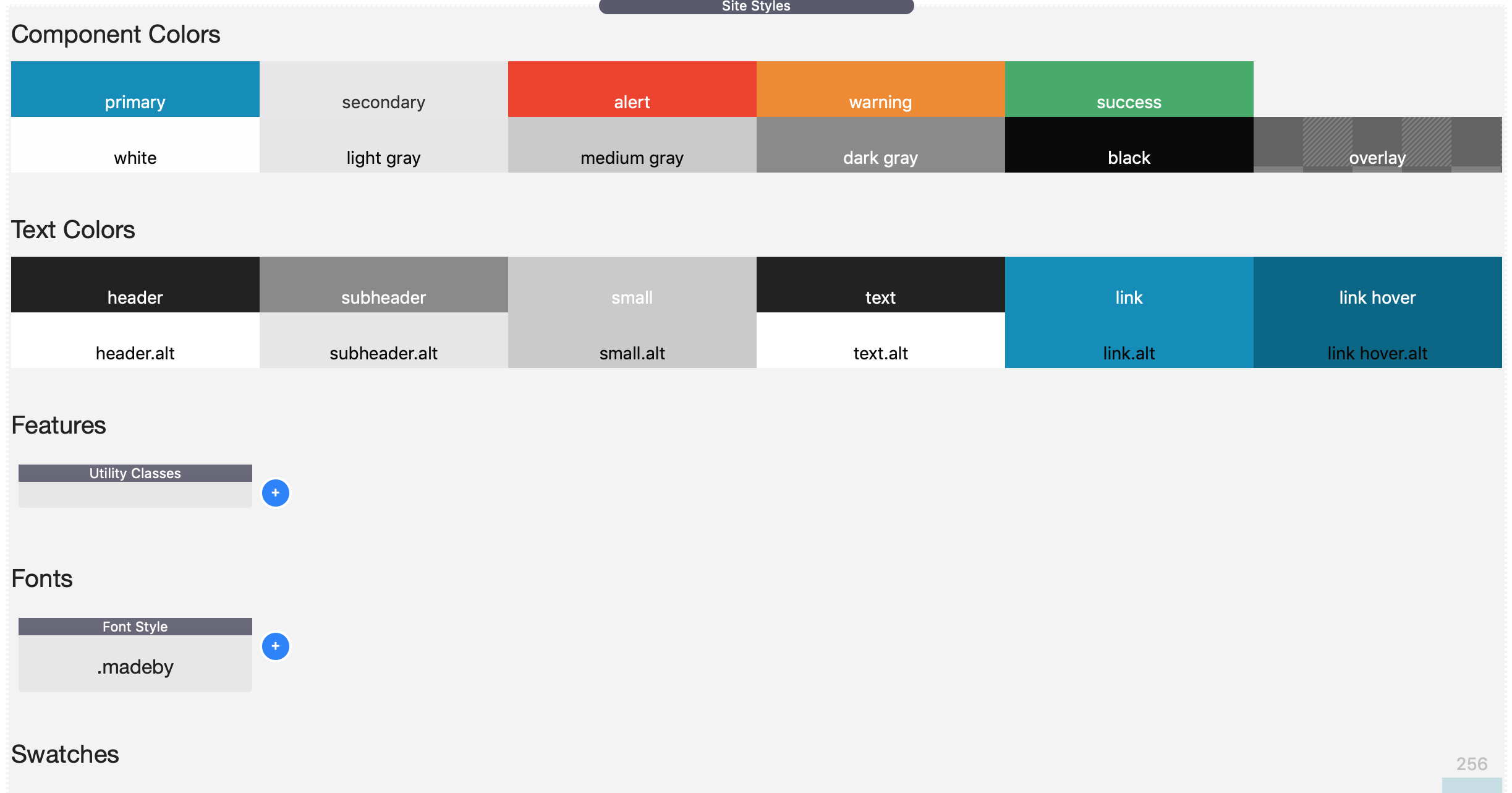
The Site Styles stack is the one stack that will manage off of the styles for your site and how to behave globally. This is where you control:
- Site Background Settings
- Site Width (The default width your content will display in)
- Site Colors (Buttons, alerts, etc)
- Default Text Colors (Headers, Paragraphs, etc)
- Default Text Sizing (Headers, Paragraphs, etc; and their behavior in Small, Medium and Large devices)
- List Styles (Bullets, Numbered lists and Indents)
- Default Radius for Site Elements. (Example: buttons with rounded corners)
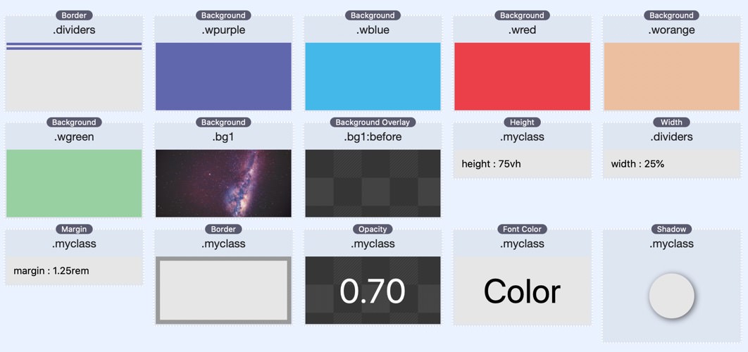
Moreover, Site Styles is infiintely extensible with Swatches. Swatches allow you to define individual styles that can be leveraged across any other stack on your site. This include styles for fonts, backgrounds, height, paddings & margins, overlays, shadows and much more. It's also where you load Features like Font Awesome, Utility Classes and other cool stuff.
Swatches
Swatches are the source of much of the new power that Foundation 6 brings. Swatches bring an entirely new workflow that will both save you time and make your websites faster. The basic premise behind a swatch is that you can create and manage your style in one central location. This allows you to apply the same styles to multiple stacks at once. This means that when you need to update your styles in the future, you can do it in just one place, saving you time and headache.
There are over 30 swatches included out of the box. In addition, there a bunch of 3rd party stacks that ship with swatches just for Foundation 6 as well. Here is a list of style swatches that ship with Foundation 6.
- Background
- Border
- Font Color
- Font Styles
- Font Loader
- Font Awesome 4 + 5 Pro
- Height
- Margin
- Opacity
- Padding
- Background Overlay
- Padding
- Position
- Rounding
- Shadow
- Width
- Transition
- Custom CSS
- Component Colors
- Text Colors
- Menu Styles
- Top Bar Styles
New Swatch Pack
We have an additional Swatch Pack that contains a bunch more powerful swatches for Foundation. There are more advnaced swatches that allow you to really take you websites to the next level.
Font Awesome 5 Pro
You get a full Font Awesome 5 Pro license for every website that you build with Foundation 6. This include almost 8000 SVG icons that you can use throughout your site. This alone would cost you $99/yr if purchase directly from them.
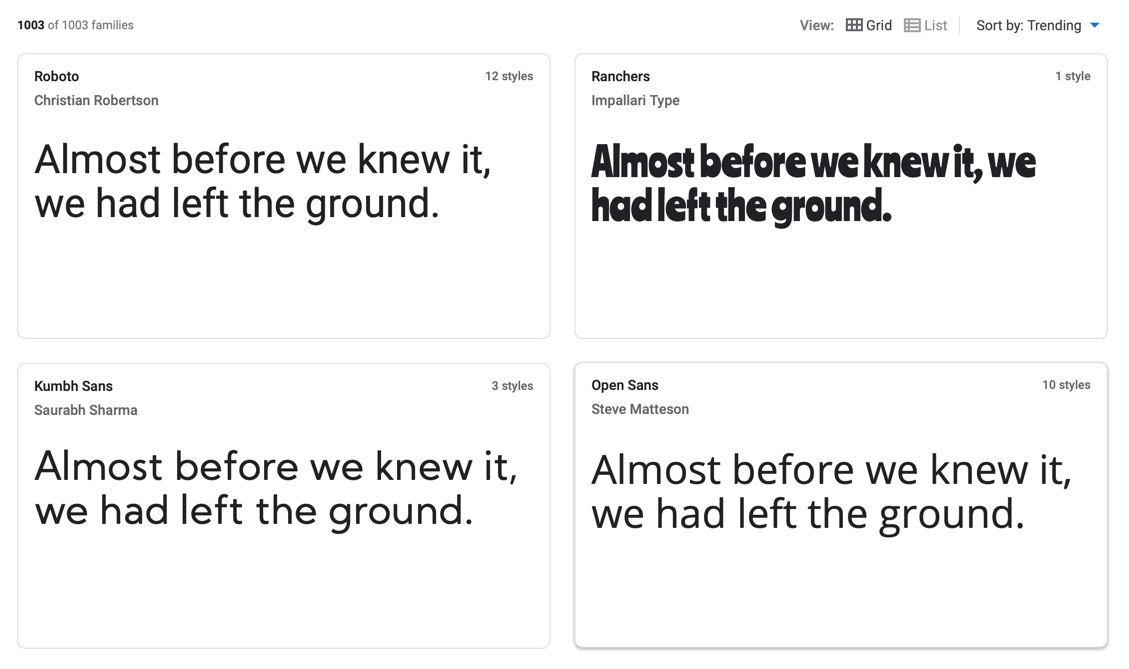
Google + Web Fonts
You can load from over 1000 fonts on Google Fonts. You can also load any web font that you have purchased or downloaded off the web.
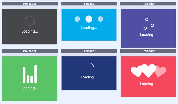
Site Preloader
When loading resources such as fonts, videos or large images, user can see a "flash of unstyled content" (commonly referred to as FLOUC) on your webpage. Foundation 6 ships with a perloader that can be added to your page so that usrs see a "loading" message along with a nice animated SVG. This can give your site that last professional touch that you need.
Below is a small sample of preloaders that can be used to fill the browser whiel the webpage assets are loading in the background.
Utility Classes
Site Styles supports hundreds of utility classes that you can easily add to any stacks element in order to apply premade styles without having to use a swatch. Overtime, you will come to use utility classes to quickly prototype layouts faster than ever before. Below is just a small sample of what is available.
Typescale
- h1
- h2
- h3
- h4
- h5
- h6
-
Adjust font-size by overriding an element’s default size.
This can be useful to size a
porh1throughh6using Foundation's existing header sizes.
Lead Paragraph
- lead
- A slightly-larger-than-normal block of text, useful for decks, blurbs, or other descriptive text.
Statistics
- stat
- You might need to display some important numbers real big. Just add this class to any element to amp up the font size.
Shadow
- shadow
- Add a basic shadow to anything with this class.
Right-to-Left
- rtl
- Make a portion of your page Right-to-Left by applying this class to it. This could be useful if you want right aligned bullets. However, this class could cause some formatting issues with some text.
No Click
- no-click
- When this class has been added to an element, the browser will disable all clicks on it and any element inside of it.
Render Performance
- render-perf
- Allows you to inform the browser to delay rendering of portions of the webpage until after the webpage has completely loaded. This can improve page performance. You should only apply this class to containers that are "below the fold". This feature may not work in all browsers. As of Jan 2021, only Chrome and Edge support this. Visit https://web.dev/content-visibility/ for more details.
Un-bulleted List
- no-bullet
-
In Foundation, the
ulis a bulleted list andolis a numbered list by default, but you can add this class to remove the bullets and numbers respectively.
Text Truncate
- text-truncate
- The .text-truncate class will truncate your text and display an elipsis. This class works for a single line of text.
Text Wrap
- text-nowrap
- text-wrap
-
If you would like to prevent the text wrapping into the next line you
can utilize .text-nowrap. Please note that the text will continue to
be in same line unless the
brtag is used. To force text to wrap to the next line, you can use .text-wrap.
Content Alignment Classes
- text-left
center/right/justify - medium-text-left
center/right/justify - large-text-left
center/right/justify - You can change the text alignment of an element by adding .text-left, .text-right, .text-center or .text-justify to an element. Adding a breakpoint to the front of a text alignment class will cause it to only be applied on that size screen or larger. For example, .medium-text-center will keep text left-aligned on the smallest screens, but switch to center-aligned on medium screens and larger.
Visibility Classes
- hide
- visible
- invisible
- show-for-print
- hide-for-print
- show-for-dark-mode
- hide-for-dark-mode
- show-for-sr
screen readers - show-for-portrait
portrait/landscape - hide-for-portrait
portrait/landscape - show-for-small
small/medium/large - hide-for-small
small/medium/large - show-for-small-only
small/medium - hide-for-small-only
small/medium - Visibility classes let you show or hide elements based on screen size or device orientation. You can also use visibility classes to control which elements users see depending on their browsing environment.
Float Classes
- float-left
- float-right
- float-center
- clearfix
- You can change the float behavior of an element by adding the .float-left or .float-right classes to an element. To clear floats, add the class .clearfix to the parent element.
- Okay, it's not really a float, but you can add the .float-center class to an element to engage the automatic margin centering trick. Note that this will only work on elements with an absolute width, which means not a percentage or auto width.
Animate on Scroll
- animate-on-scroll
- When you add this class to a stack, it can trigger swatch transitions when scrolled into view. Create a base style swatch. Then create a second swatch for the style that will be applied after the stack has scrolled into view. In this swatch, you will want to set the Pseudo State to be Animated. You will also want to add a Transition swatch in order to control the timing of the style animation.
Unordered List Styling
- list-disc
- list-circle
- list-square
- list-decimal
-
In Foundation, the
ulis a bulleted list, but you can add these classes to customize the type of bullets used.
Ordered List Styling
- list-lower-alpha
- list-lower-latin
- list-lower-roman
- list-upper-alpha
- list-upper-latin
- list-upper-roman
-
In Foundation, the
olis a numbered list, but you can add these classes to customize the type of index unit used.
Component Styling
- radius
- rounded
- shadow
- bordered
- These classes can be used independently or together to style the component by rounding its corners, giving light borders, and creating shadow to it respectively. Mostly used in buttons, cards, tables, images and many more.
Font Styling
- font-normal
- font-bold
- font-italic
- font-wide
- You can use font styling to style your text. You can change the font styling by adding font-normal, font-bold, font-italic to an element. You can also wider the text of an element with font-wide.
Text Transformation
- text-uppercase
- text-lowercase
- text-capitalize
- Text transformation lets you control the capitalization of text. You can change the text transformation by adding .text-uppercase, text-lowercase, text-capitalize to an element.
Text Decoration
- text-underline
- text-overline
- text-line-through
- Text Decoration can be used to underline, overline, or line-through a text. You can change the text decoration by adding .text-underline, .text-overline, or .text-line-through to an element.
Border Box
- border-box
- Border box lets you only add the content, padding and border, but not the margin within the width and height CSS properties.
Border none
- border-none
- Border none lets you quickly resets border to none for any element.
Display Classes
- display-inline
- display-inline-block
- display-block
- display-table
- display-table-cell
- Display classes allow you to change the display property of any element.
Positioning
- position-relative
- position-absolute
- position-fixed
- position-fixed-top
- position-fixed-bottom
- position-static
- Positioning classes help you change an element's position value. By default, an element's postion value is static.
Overflow
- overflow-visible
- overflow-hidden
- overflow-scroll
- overflow-x-visible
hidden/scroll - overflow-y-visible
hidden/scroll - These overflow classes helps you to clip content, render scrollbars or simply just display the content when it overflows its block level container.
Margin Helpers
- Available Margin Sizes
- auto, 0, 1, 4, 8, 12, 16, 20, 24, 32, 40, 48, 64, 80, 96, 128, 160, 192, 224, 256
- m:{size}
Margin All Sides - mt:{size}
Margin Top - mb:{size}
Margin Bottom - ml:{size}
Margin Left - mr:{size}
Margin Right - mx:{size}
Margin Horizontal - my:{size}
Margin Vertical - -{m|mt|mb|ml|mr|mx|my}:{size}
Negative Margins - md:{m|mt|mb|ml|mr|mx|my}:{size}
Medium Breakpoint (Utility Extra) - lg:{m|mt|mb|ml|mr|mx|my}:{size}
Large Breakpoint (Utility Extra) -
We have a large number of classes to allow you to easily add margins to your designs.
There is a simple format to remember these classes:
{breakpoint}:{margin}:{size}. - The breakpoint is optional. When excluded, the margin will apply to all sizes. You can supply a medium (md) and large (lg) options. In order to use these classes you will need to make sure that the Utility Extra CSS is loaded.
- The margin is required. The available options are: Margin (m), Margin Top (mt), Margin Bottom (mb), Margin Left (ml), Margin Right (mr), Margin Horizontal/L&R (mx), Margin Vertical/T&B (my). When you prepend this with a dash (-), you can make the margin become a negative margin.
- The size attribute can be any of the above values. If you are curious as to how these numbers actually affect the margins. For ease of use, all of the sizes are defined in pixels. However, on the published site, all values are set in REM. This is done in order to make your site sizing scale properly on mobile devices.
Padding Helpers
- Available Padding Sizes
- 0, 1, 4, 8, 12, 16, 20, 24, 32, 40, 48, 64, 80, 96, 128, 160, 192, 224, 256
- p:{size}
Padding All Sides - pt:{size}
Padding Top - pb:{size}
Padding Bottom - pl:{size}
Padding Left - pr:{size}
Padding Right - px:{size}
Padding Horizontal - py:{size}
Padding Vertical - md:{p|pt|pb|pl|pr|px|py}:{size}
Medium Breakpoint (Utility Extra) - lg:{p|pt|pb|pl|pr|px|py}:{size}
Large Breakpoint (Utility Extra) -
We have a large number of classes to allow you to easily add padding to your designs.
There is a simple format to remember these classes:
{breakpoint}:{padding}:{size}. - The breakpoint is optional. When excluded, the margin will apply to all sizes. You can supply a medium (md) and large (lg) options. In order to use these classes you will need to make sure that the Utility Extra CSS is loaded.
- The padding is required. The available options are: Padding (p), Padding Top (pt), Padding Bottom (pb), Padding Left (pl), Padding Right (pr), Padding Horizontal/L&R (px), Padding Vertical/T&B (py).
- The size attribute can be any of the above values. If you are curious as to how these numbers actually affect the padding. For ease of use, all of the sizes are defined in pixels. However, on the published site, all values are set in REM. This is done in order to make your site sizing scale properly on mobile devices.
Width Helpers
- Available Width Sizes
- auto, full, screen, fit, 0, 1, 2, 3, 4, 5, 6, 8, 10, 12, 16, 20, 24, 32, 40, 48, 56, 64
- 1/2
- 1/3, 2/3
- 1/4, 2/4, 3/4
- 1/5, 2/5, 3/5, 4/5
- 1/6, 2/6, 3/6, 4/6, 5/6
- 1/10, 2/10, 3/10, 4/10 ... 9/10
- 1/12, 2/12, 3/12, 4/12 ... 11/12
- w:{size}
Width - md:w:{size}
Medium Breakpoint (Utility Extra) - lg:w:{size}
Large Breakpoint (Utility Extra) -
We have a large number of classes to allow you to easily define widths to your designs.
There is a simple format to remember these classes:
{breakpoint}:w:{size}. - The breakpoint is optional. When excluded, the width will apply to all sizes. You can supply a medium (md) and large (lg) options. In order to use these classes you will need to make sure that the Utility Extra CSS is loaded.
- The size attribute can be any of the above values. As explained in margins and padding, each size is the scale is defined in pixels. But the published site will have REM.
-
Some sizes are defined as fractions. These will allow you to do percentage layouts easily.
A size of
1/2will be50%and a size of6/10is60%.
Height Helpers
- Available Height Sizes
- auto, full, screen, 0, 1, 4, 8, 12, 16, 20, 24, 32, 40, 48, 64, 80, 96, 128, 160, 192, 224, 256
- 10vh, 20vh, 30vh, 40vh, 50vh, 60vh, 70vh, 80vh, 90vh, 100vh
- 25vh, 50vh, 75vh
- 33vh, 66vh
- h:{size}
Height - md:h:{size}
Medium Breakpoint (Utility Extra) - lg:h:{size}
Large Breakpoint (Utility Extra) -
We have a large number of classes to allow you to easily define heights to your designs.
There is a simple format to remember these classes:
{breakpoint}:h:{size}. - The breakpoint is optional. When excluded, the height will apply to all sizes. You can supply a medium (md) and large (lg) options. In order to use these classes you will need to make sure that the Utility Extra CSS is loaded.
- The size attribute can be any of the above values. As explained in margins and padding, each size is the scale is defined in pixels. But the published site will have REM.
Z-Index Helpers
- Available Z-Index Sizes
- -1, 0, 1, 2, 3, 4, 5, 10, 20, 30, 40, 50, 99, 999, 9999
- -z:1
-1 z-index - z:{size}
z-index - zmax
maximum z-index -
The size attribute can be any of the above values. So
z:10will result in a z-index of 10.
Background Color Helpers
- Available Colors
- white, black, light-gray, medium-gray, dark-gray, overlay
- primary, secondary, success, warning, alert
- bg:{color}
- The color values are the corresponding colors that you define inside Site Styles. The Component Colors swatch will affect these color values as well.
Text Color Helpers
- Available Colors
- white, black, light-gray, medium-gray, dark-gray
- primary, secondary, success, warning, alert
- header, subheader, small, text, link
- color:{color}
- The color values are the corresponding colors that you define inside Site Styles. The Text Colors and Component Colors swatch will affect these color values as well.
Date Part Helpers
- current-day, current-month, current-year
- current-hour, current-minute, current-second
- current-weekday, current-dayPeriod
- current-timeZoneName
- You can place these classes on any element and this content will be dynamically replaced on page load with that part of the current datetime. This is very useful for keeping the year up to date in your copyright strings.
- Config JS Snippet
-
You can tweak the format of these date parts with the following JS snippet on your page.
window.dateFormat = {
    // numeric 2-digit long short narrow
    month        : '2-digit',
    // numeric 2-digit
    day          : '2-digit',
    year         : 'numeric',
    hour         : '2-digit',
    minute       : 'numeric',
    second       : 'numeric',
    // long short narrow
    weekday      : 'long',
    dayPeriod    : 'short',
    // true false
    hour12       : false,
    // long short shortOffset longOffset
    timeZoneName : 'short',
};
- Disable Date Helpers - JS Snippet
-
You can tweak disable all Date Helper classes with the following JS snippet.
window.disableDateHelpers = false;
Full Date Helpers
- current-date, current-time, current-dateTime
- These classes will output the full date and time strings with the current date and time.
- Config JS Snippet
-
You can tweak the format of these date parts with the following JS snippet on your page.
// full long medium short
window.dateStyle = 'long';
window.timeStyle = 'medium'
Sharesheet Helpers
- sharesheet
-
This will add a sharesheet to any elemenet when it's clicked. Based on the content and attributes on the
element, the sharesheet will be populated with the appropriate content. You can use the following attributes
to customize the sharesheet:
data-url,data-title,data-text,data-file. - By default, any link or button with the sharesheet class will be hidden on all browsers that do not support the sharesheet.
- sharesheet-nohide
- This class will prevent the autohide behavior on links or buttons.
- sharesheet-autohide
- This class will extends the autohide behavior to any element with this class.
Disable Right Click
- no-right-click
- Disable right click/contextual menu for anything this class is added to.
Video Tutorials
Below are video tutorials that are relevant to the stacks used on this page.