

Menu Builder
The Foundation stacks allow you to use the menu generated by RapidWeaver. While this is very convenient, you can get a bit more power using the built-in menu builder. This allows you to manually build a menu however you want.
The menus stacks that come with F6 are meant to be very modular. This allows you to mix and match them with other Foundation components to make the perfect menu for your design.
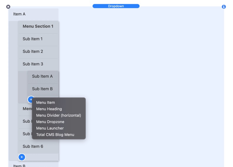
All of the menus will let you add:
- A menu item (A regular link (you can link to pages within your RW project or external links with or without custom attributes)
- A menu heading (very useful when you have dropdown menus and you do not want the parent link to be clickable)
- A menu dropzone, into which you can drop anything you want, a text, a picture, an SVG.
- Menu Launcher (another menu item that will launch a lightbox, a dropdown or an Off Canvas)
- Total CMS Blog Menu (A menu item that you or your client can control from their Total CMS Admin panel!)
- Every menus has a bunch of different alignment and spacing options to give you very different looks and feels to the same menu.
Dropdown Menu
The Dropdown menus, similar to the above menu, can be laid out both vertically and horizontally. However, as you would expect, you can have dropdown submenus triggered by the cursor. The Dropdown menu supports as many levels of submenus as you could want.
Simple Dropdown Menu
Vertical Menu
Accordion Menu
The Accordion menu is a vertical only menu that will aniamte all submenus as a traditional accordion. You can has mutlple levels of acccordion submenus.
Drilldown Menu
Drilldown is one of Foundation's three menu patterns, which converts a series of nested lists into a vertical drilldown menu. This menu works best on smaller devices or in a smaller fixed container on larger devices.
Responsive Transformation
Our three Menu patterns form like Voltron into one responsive Menu plugin, which allows you to switch between patterns at different screen sizes. In this example below, a Drilldown menu will be used on small devices. THe menu will transform into a Dropdown menu on medium and large devices.
Top Bar
Top Bar is a simple wrapper around your menu components. It’s a useful container that allows you to easily switch between a traditional horizontal menu on larger screens and a hamburger style menu on smaller mobile devices. While the example below uses Drilldown and Dropdown responsive menus, you can use any of the menus within Top Bar.
On Page Nav
Every menu can be used to navigate to sections on the same page. The menu tracks the active section of a page your user is in. You can see this in action via the menu on this very webpage. The menu links to each section on this page. As you scroll down the page, the active section that you are in will be highlighted inside of the menu.
Build your Custom Menu
Many of the menu examples on this page are very simple. This is because the raw menus that come with Foundation are meant to not have an opinionated design. This allows you to easily incorporate the menus into your designs. You can also mix and match the menus with many different Foundation components to make completely different types of menus. Here are a few examples below that can get your creative juices flowing. The possibilities of what can be done with menus really is endless.
Mega Menu
The Mega Menu here uses a plan menu stack along with a Dropdown Component. The Dropdown is set to be full width. Then you can place whatever data you would like inside of the menu. It could contain more data as well as more navigation to other pages on the website.

Mega 1
Lorem ipsum dolor sit amet, consectetur adipisicing elit, sed do eiusmod tempor incididunt ut labore et dolore magna aliqua. Ut enim ad minim veniam, quis nostrud exercitation ullamco laboris nisi ut aliquip ex ea commodo consequat.
Mega 2
Lorem ipsum dolor sit amet, consectetur adipisicing elit, sed do eiusmod tempor incididunt ut labore et dolore magna aliqua. Ut enim ad minim veniam, quis nostrud exercitation ullamco laboris nisi ut aliquip ex ea commodo consequat.
Lightbox Menu
This Lightbox menu uses a Hamburger button to open a lightbox that contains a simple vertical menu. The lightbox goes fullscreen on mobile to make it more user friendly.
Banner Menu
The banner menu overlays a simple menu stack on top of a banner image. This is a widely used layout in many websites. When this layout is on mobile devices, there isn't enough space to fit all of the menu items. Therefore, on mobile, a hamburger is displayed that will open the menu inside of a lightbox.
Video Tutorials
Below are video tutorials that are relevant to the stacks used on this page.